Performing EDA on a dataset is very difficult and time taking process because there is many thing you can do while performing EDA on your dataset.

I will generally use
polarslibrary in this article.For plotting I’ll generally use
seabornlibrary.First perform univariate analysis without any column dropping, after that perform BiVariate analysis and then decide whether to drop a feature or not. Also, provide a argument which proofs that your dropping decision is right.
Numerical Features
There are some basic Descriptive Analysis you can do with numerical column like mean, median, quantiles, etc. You can do this by calling the polars.DataFrame.describe method.
Univariate
Skewness
Skewness is a measure that describes the asymmetry or lack of symmetry in the distribution of a dataset. The value of skewness can provide insights into the shape and nature of the data distribution. Here’s how to interpret skewness values:
| Skewness Value | Interpretation |
|---|---|
| Negative Value | The distribution is left-skewed or negatively skewed. This means the tail on the left side of the distribution is longer, and the bulk of the values are concentrated on the right side of the distribution. The mean is typically less than the median. |
| Positive Value | The distribution is right-skewed or positively skewed. This means the tail on the right side of the distribution is longer, and the bulk of the values are concentrated on the left side of the distribution. The mean is typically greater than the median. |
| Zero | The distribution is symmetric, with no skew. The mean, median, and mode are approximately equal, and the distribution is evenly balanced on both sides. |
The magnitude of the skewness value also provides information about the degree of skewness:
- If the skewness value is close to 0 (between -0.5 and 0.5), the distribution is approximately symmetric with little to no skew.
- If the skewness value is significantly negative (below -1), it suggests strong left skewness.
- If the skewness value is significantly positive (above 1), it suggests strong right skewness.
In summary, the interpretation of skewness values is as follows:
- Negative skewness: The distribution is left-skewed, with the tail extending towards the left.
- Positive skewness: The distribution is right-skewed, with the tail extending towards the right.
- Zero skewness: The distribution is symmetric, with no skew.
- Magnitude of skewness: Indicates the degree of skewness, with values close to 0 suggesting little to no skew, and values below -1 or above 1 suggesting strong skewness.
Use polars.Series.skew method to calculate skewness of a numerical feature.
Kurtosis
Kurtosis is a statistical measure that describes the degree of peakedness and tailedness of a probability distribution. It provides information about the shape of the distribution, specifically the proportion of data that is concentrated in the tails compared to the normal distribution.
There are three main types of kurtosis:
- Mesokurtic: A distribution with a kurtosis value of 3, which is the same as a normal distribution. This indicates a moderate level of peakedness and tailedness.
- Leptokurtic: A distribution with a kurtosis value greater than 3. This indicates a higher, more peaked distribution with heavier, fatter tails compared to a normal distribution. Leptokurtic distributions have more outliers and extreme values.
- Platykurtic: A distribution with a kurtosis value less than 3. This indicates a flatter, more dispersed distribution with lighter, thinner tails compared to a normal distribution. Platykurtic distributions have fewer outliers and extreme values.
The excess kurtosis is calculated by subtracting 3 from the kurtosis value. Positive excess kurtosis indicates a leptokurtic distribution, while negative excess kurtosis indicates a platykurtic distribution.
In summary, kurtosis provides information about the shape of a distribution, specifically the concentration of values in the tails compared to a normal distribution. Higher kurtosis indicates more outliers and extreme values, while lower kurtosis indicates fewer outliers and a more dispersed distribution.
Use polars.Series.kurtosis method to calculate kurtosis value of a numerical feature. This method has fisher
argument, if fisher=True then normal is 0.0; if fisher=False then normal is 3.0.
Distribution
kdeplot: Plot distribution of data using Kernel Density Estimation.histplot: Plot histogram of data.ecdfplot: Plot empirical cumulative distribution functions.rugplot: Plot marginal distributions by drawing ticks along the x and y axes.
See
seabornlibrary docs to plot different data distribution.
Box Plot
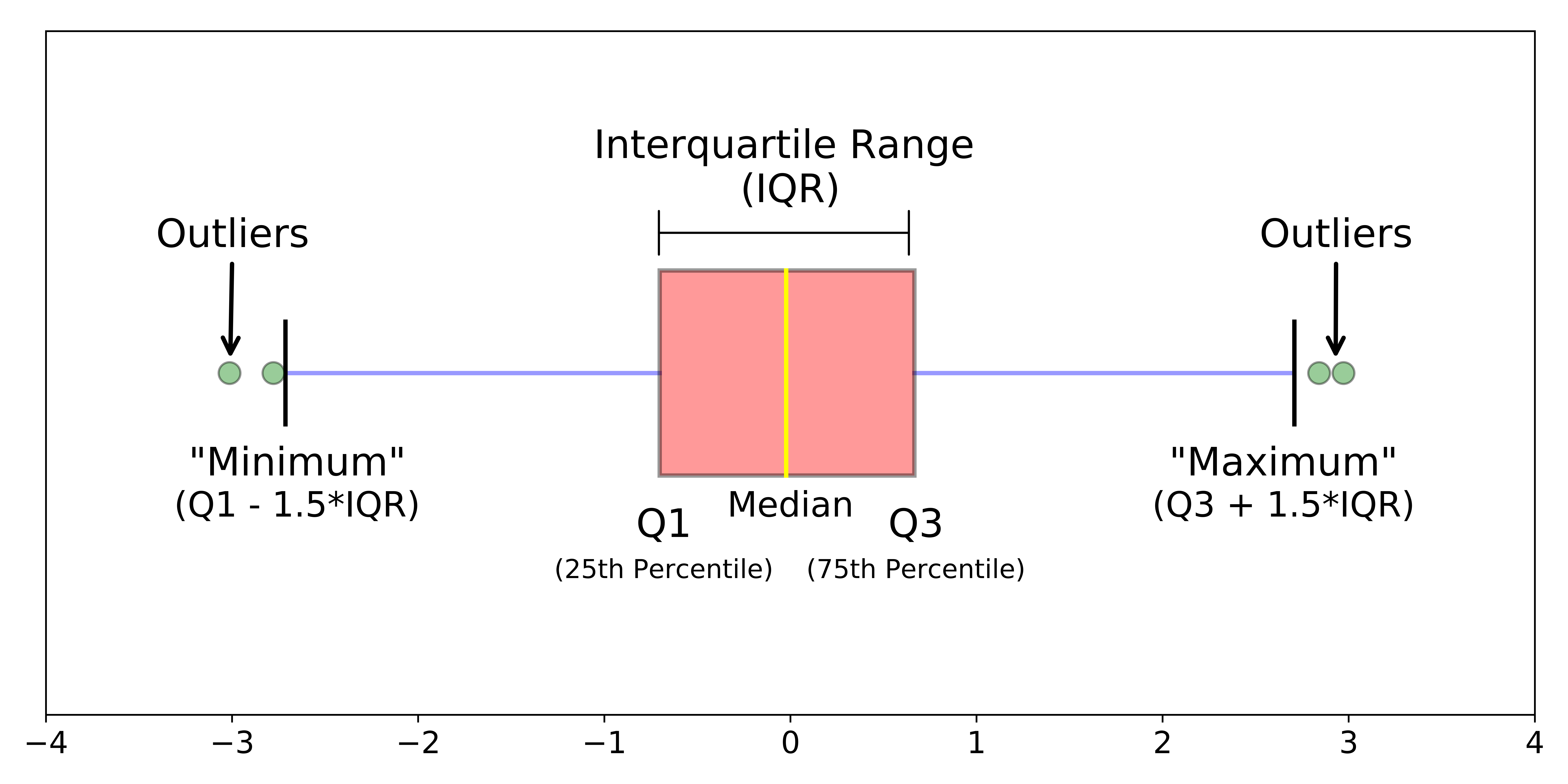
Plot the 5-number summary of data with BoxPlot.
What is 5-number summary of a data?
This represents the #!math (\text{Q1} - 1.5*\text{IQR}), 25th %tile #!math (\text{Q1}), 50th %tile, 75th %tile
#!math (\text{Q3}) and #!math (\text{Q3} + 1.5*\text{IQR}) values of data.
BoxPlot easily shows the outliers of the data.

Percentile
You can use mean or median to know the central value of data. But what about identifying specific data points relative to the entire dataset’s distribution?
Percentiles offer a solution by dividing the data into hundredths and determining where a particular value falls within that range. They provide valuable insights into the spread and distribution of data, aiding in comparisons and understanding the dataset’s overall characteristics.
You can use percentile to know dataset’s outlier values. After ploting BoxPlot you can manually check the outlier values with 95%tile or 99%tile.
Use polars.Series.quantile method to calculate nth quantile of dataset.
BiVariate
Regression Plots
- Regression Plot: Scatter plot but with a best-fit regression line in there.
- Residual Plot: Plot the residuals/error of a regression model and check whether it any linear relationship.
See seaborn library docs for regression plots details.
Relational Plots
- Scatter Plot: Check the linear relationship between two datasets.
- Line Plot: Plot the relationship between
xandywith many parameters such ashue,sizeandstyle.
See seaborn library docs for relational plots details.
More Plots
- FacetGrid
- PairPlot
- JointPlot
Checkout seaborn docs for more details.
MultiVariate
Correlation
MultiCollinearity
Extra Concepts
- Homoscedasity (concept)